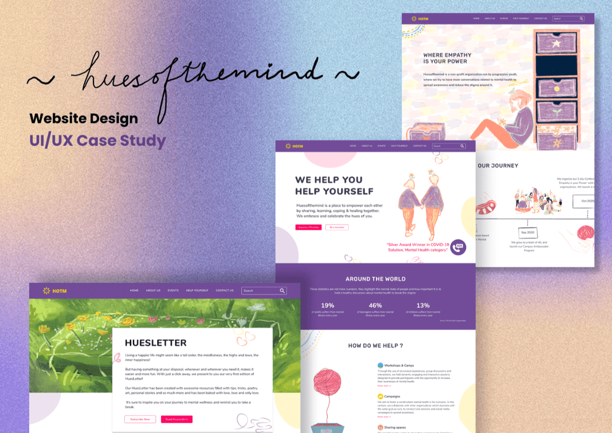
Hues of the Mind
Hues of the Mind is a mental health organization dedicated to making mental health resources accessible to everyone. Focused on providing educational content, therapy services, and mental health support, Hues of the Mind needed an inclusive, user-friendly digital platform that reflected their mission of making mental health care accessible and inclusive for all. I led the brand refresh, website redesign, and accessibility improvements to ensure a seamless and inclusive user experience.
Timeline
UX Designer
Company
huesofthemind
Year
2020
Live website
INTRODUCTION
Hues of the Mind’s mission is to break the stigma around mental health by providing accessible, affordable mental health resources. They required a platform that would be easy to navigate for users of all abilities and backgrounds while delivering vital content, resources, and services. The challenge was to make their existing platform more inclusive, visually appealing, and accessible, ensuring that everyone, regardless of their mental or physical abilities, could easily access mental health resources.
MY ROLE
Branding, website redesign, UX design, accessibility improvements, and development.
CHALLENGE
Hues of the Mind’s existing platform lacked accessibility features and was difficult for users with varying abilities to navigate. The website needed to reflect the inclusive nature of their mission, with improved functionality, better readability, and a more engaging design. The challenge was to redesign the platform with a focus on accessibility while maintaining its core goal of educating and empowering individuals to prioritize their mental health.
BRAND STRATEGY AND RESEARCH
We started by understanding Hues of the Mind’s audience, which includes a diverse range of users seeking mental health support, including those with visual impairments, cognitive challenges, and other disabilities. The brand needed to be approachable and inclusive, ensuring that users of all backgrounds felt welcomed and supported when accessing the platform.
Key Insights:
Mental health resources should be easy to access, with a focus on clear communication and engaging content.
The brand needed to reflect trust, safety, and support to encourage users to seek help without feeling overwhelmed or judged.
The website needed to be WCAG-compliant, ensuring accessibility for all users, including those with disabilities.
BRANDING DEVELOPMENT
We worked on refreshing the brand identity to make it more inclusive, uplifting, and reassuring. The goal was to create a welcoming environment where users felt safe accessing mental health resources.
Visual Identity:
A soft, calming color palette was chosen to reflect mental wellness and create a sense of peace and safety.
A redesigned logo symbolized support and inclusivity, with modern, approachable typography that is easy to read.
A design system focused on accessibility, using high-contrast elements, large font sizes, and clear hierarchy to ensure readability for all users.
The website redesign aimed to create an accessible and inclusive experience where users could easily find and access mental health resources, whether they were educational materials, therapy services, or community support. The platform needed to accommodate all users, including those with visual impairments, motor difficulties, or cognitive challenges.
Key Features:
Accessible Navigation: The redesigned website featured improved navigation with easy-to-read fonts, high-contrast colors, and keyboard navigation to ensure usability for all users.
WCAG Compliance: We ensured the website adhered to WCAG 2.1 AA standards, including features like alt text for images, text resizing, and screen reader compatibility.
Educational Resources: The website featured clear, accessible educational content on mental health topics, making it easy for users to find the information they need.
Mobile Optimization: The website was optimized for mobile to ensure users could access resources on any device.
ACCESSIBILITY IMPROVEMENTS
Ensuring accessibility was a core part of the project, with a focus on making the platform usable for people of all abilities. We implemented several key accessibility features to ensure compliance with WCAG standards and create a better user experience for everyone.
OUTCOME
85% increase in website traffic within three months of the redesign, reflecting better user engagement.
30% increase in session time, as users spent more time exploring the educational resources and mental health services.
WCAG 2.1 AA compliance, ensuring the website is fully accessible for users with disabilities, improving overall usability and inclusivity.
IMPACT
Hues of the Mind successfully enhanced its digital presence by becoming a more accessible, inclusive, and user-friendly platform for mental health resources. The redesign ensured that all users, regardless of their abilities, could easily access the mental health support they need, while the brand refresh created a more welcoming, supportive atmosphere that aligned with their mission of breaking mental health stigma.
